Maybe I am Finally Starting To Understand html

The preliminary website for my final project is now online.  It can be found at http://www.danielcurry.org/Final_index.html

It still needs some work.  First, I need to fix the H1 and H2 and integrate them into the background image.  I also want to work with the fonts to better represent the era of the 1940’s and 1950’s.  Second, some of the individual pages are fairly long.  I am thinking about adding additional navigation tabs so that information can be accessed in smaller amounts.  Specifically, I am thinking of breaking up the “Tri-Valley Townsman” section into three separate sections.  I also want to add some block quotes and also work a little more with the images before the final project is completed. 

Overall, the final project was less frustrating for me than the portfolio, type and image assignments.  I am actually starting to feel comfortable with the basics of coding.  There were far fewer instances of “why is it doing that!” with this assignment.  I look forward to improving the site over the next week. 

Design Assignment

For the design of my final project.  I will use the color and themes off of the following picture:

Image

I will have a gray background color, orange “roll over” color and green sub-headers.  They gray represents the concrete used to build the reservoirs.  These reservoirs eventually come to represent the reimagined community that is the topic of my website.  The green represents the rural past and present that also represents the reimagined community.  I am still working on bringing in an appropriate font for my website.  I had a close call with almost downloading a virus in an attempt to download a font off of “fontspace.com.”  Because of this close call, I will seek assistance before attempting to download a font again.   

Portfolio Update

I spent some time re-doing my portfolio this week.  Still not perfect, but much better than it was.  Despite looking at other people’s code and searching for solutions on the web, I still could not figure out how to get my caption to go under my picture.  But, despite this, my portfolio is much improved.  Take a look at http://www.danielcurry.org.  Also of note, I FTP’d the updated portfolio with no outside assistance.  I might get the hang of this digital media stuff yet.   


Image Critiques

For the image assignment, I critiqued the images of Mika Endo and Beth Garcia.  In general, both of them did a very good job.  After comparing my work to theirs, I concluded that I light hand and subtle changes are best when working with Photo shop. 

My comments for Mika’s images included:

1. Great job on the images.  On the cropped and resized image, I can see a lot of change. 

  • Words cropped out of photo

  • The man’s arm lost in the shadow between his body and the piano is defined. 

  • Contrast and color is improved and there is more definition between his body and the door. 

  • Back wall also looks cleaner. 

I think what you did was a good job.  Significant changes but very hard to pick up.

2. Great job on the colorization (I should have stuck around longer so you could help me with this.  My colorization looks like a 6 year old with crayola crayons).  The flag, clothes and coat look completely authentic.  I love how you were able to keep the integrity of the shadows as well.

3. Good job on the vignette.  I would make it a little more subtle by lightening the vignette, but this would be a decision to make based on how you would use the photograph. 

4. Wow!  This a very good job.  There was extensive damage to the original and it is hard to see where you photoshopped them out.  You have a very light hand which is perfect for this kind of work. 

5. Good job taking out the background without losing detail of the two main Native Americans.   This will work well on a website. 

 My comments for Beths images included:

1. The difference between the original and updated photo is tremendous.  Not only have you taken out the damage from the poster, the updated photo is very crisp.  I can almost feel the sun coming down on the tent because of the shadows and added light.  Making the signs more legible is definitely a huge improvement. 

2. Wow! It is amazing how much you can do with a photo without using the individual tools on the left side of Photoshop (other than crop).  I really like the border you chose for this photo.  It fits the era and feel of the picture.  It makes it feel like I am looking in a photo album instead of on a website. 

3. Very nice job with the colorizing.  Having a “light” touch is extremely important. 

4. I think you did a great job with the vignette.  It is very subtle and if I wasn’t looking for it I might not notice it right away.  Again, subtlety is the key.

5. The matting of the background blends perfectly with the background of your website.  I don’t think you could do any better without losing detail in the engraving. 


Image Assignment

For this week’s assignment, we were required to demonstrate mastery of image editing skills, color and composition.  To accomplish this, we were asked to create a web page that includes: a cropped & resized image, a restored photograph, a hand-colored photograph, a vignette photograph, a matted engraving and a “before & after” for each example. 

The original before photograph I used was this image of Stephen Curry (My Great-Grandfather’s Great-Grandfather) who died at the age of 101 in 1872.  I believe this picture was taken circa 1870.  The image has several problems to include: general fading and yellowing, loss of facial details due to fading, blending of chair with black suit, complete fading of hair on the left side of head, complete fading of jaw line on right side of face.

Image

To improve and fix the issues identified above, I first used the auto contrast, auto tone and curves tool to make general improvements to the image.  After this, I experimented with changing the image into a black and white and then sepia image.  Because it seemed to bring out subtle details, I finally decided on Sepia.  I also erased the back of the chair sticking out from behind his shoulder which blended in with the dark suit and used the dodge tool to whiten his shirt and collar.  I then removed the entire background and replaced it with a light gray color that seemed to work well with the sepia. 

With these more general issues addressed, I added hair to the left side of his head by copying and flipping the hair on his right side.  I then detailed his face, hair and hands using the burn and dodge tools.  I also lightened the cane with the dodge tool in order to increase the contrast with the dark suit.  The final result is:

Image

I also added a vignette to this image which I thought resulted in a nice affect.  I did this by using the elliptical marquee and selecting the inverse.  I then used brightness and contrast to adjust the vignette.  The final result is:

Image

We were also asked to colorize the image.  I did this with a combination of the dodge and color replacement tool.  The final result is below.  The colorization of the eyes and hair did not work out well, but I thought the colorization of his skin, lips and especially the cane went relatively well.

Image

The final requirement of the image assignment was to add a matted engraving.  The engraving I chose is below.

Image

I cropped the image and then followed the directions for matting an engraving on archiva.net.  I chose the same background color used in the earlier image of Stephen Curry and will be the background color of the web page. 

Image

Overall, I was very satisfied with my progress in learning how to use Photoshop.  I made a lot of mistakes, but have become much more comfortable with the tool.  I look forward to improving my skills with Photoshop in the future.  I feel that my first cut at improving the Stephen Curry photo somehow lost the “essence” of his facial features.  In a future second attempt, I will use a much lighter hand when trying to bring out details. 


Initial Planning for Final Project

After looking at the calendar and coming to the realization that the end of the semester is quickly approaching, I felt that I needed to take a little time this week to work out the concept for my final project. The basic guidance for the final project assignment is to create a “modest, reasonably sophisticated history web site” with “solid and engaging” content and “clear in its purpose and audience.”

I have decided that the topic for my website will be the history of the Town of Neversink. I’ve chosen this topic because of my extensive knowledge of the town’s history, my access to images that will be useful for use on the website and the fact that I think there is an interesting argument to be made that could facilitate on line interactivity.

The goal I hope to achieve in building this website is to create a virtual space where individuals interested in the History of Neversink or rural history more generally can learn about the town history and its significance. A secondary goal is to provide an opportunity for individuals to contribute to the local history of the town by providing first-hand accounts of experiences, family histories and comparisons to other town histories. The historical argument my website will support is that the Town of Neversink evolved from a community whose political, social and economic gravity was decentralized and found in the individual hamlets making up the town into a more centralized community due to social and economic changes taking place in the mid-20th Century.

The entire website will include several pages dealing with the topics of early settlement and history, agricultural development, basic information about the individual hamlets, impact of the tanning industry in the 19th Century, reservoir construction, school centralization and the modern community that formed in the late 20th Century. The Home page will include a basic summary of the website purpose, website organization, links to the other pages within the website and an external link to the Time and the Valley Museum website. For the home page design, I will use images from the 1954 and 1961 Tri-Valley School Yearbooks, individual images and segments of two murals painted in the 1950’s as links to the different pages of the website.

Here are some of the initial images I plan on using as the basis for the design of my website:

This is an image of the back of the 1961 Tri-Valley School Yearbook. I plan on using Photoshop to improve this image and use it as the link to early settlement and history of Neversink. The photo depicts the Battle of Chestnut Woods Revolutionary War Historic Marker, remains of the Claryville Tannery, Lackawack Hill School, Halls Mills Covered Bridge, and Quaker Meeting House.

Picture1backyearbook

This mural is a representation of the 5 hamlets destroyed by the construction of two reservoirs. I plan to use this image as a link to a page giving a brief description of all the original hamlets that made up the Town of Neversink.Picture1losthamletmural

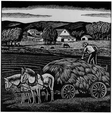
These are two images I hope to use as representations of the role of dairy farming in the town. The first is a picture of an abandoned barn which I think nicely represents the drastic decline of the family farm as an essential element to the town. The second is a picture of Ralph Schoonmaker, who was a member of the generation that lived through the changing economic conditions that resulted in the decline of the family farm.

UncleDonBarnRalph Schoonmaker on the farm by the new barn

This mural is a representation of the Reservoirs built between 1936 and 1954 and the new community that was created around the reservoirs during their construction.

Picture2reservoirmural

This is an image of the front of the 1961 Tri-Valley School Yearbook. I plan on using Photoshop to improve this image and use it as well as the cover of the 1954 yearbook (a digital image still needs to be created) as a representation of school consolidation and the impact it had on the creation of a new and more centralized community.


Picture1frontyearbook

I welcome comments regarding how to use these images in my website design and any suggestions regarding website organization.


I commented on Kirk and Paul’s Blogs.